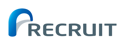
The new RECRUIT logo is here! Launching in October to boost our new business setup.
Sep. 03, 2012
Recruit Co., Ltd.
RECRUIT Co.,Ltd. (Headquarters: Chuo-ku, Tokyo; President and CEO : Masumi Minegishi) is using this opportunity to start our new group setup on October 1st, 2012 , we will be launching and progressively introduce an innovative new logo.
The New Logo has been decided on, to connect to our changing corporate setup.
From October, 2012, RECRUIT will change its group setup. Maximizing this opportunity, our new logo will be used extensively for the group companies that include “RECRUIT” brand name.

The concept behind the new logo
The logo perfectly illustrates the RECRUIT brand corporate message.
The new logo features the symbolic brandmark of a bridge, directly representing the RECRUIT brand corporate message. "The RECRUIT group are a bridge for PEOPLE and their OPPORTUNITIES, NOW and in the FUTURE, LOCALLY and also GLOBALLY."
To empower each individual to "follow your heart ", we endeavor to "meet your opportunity" for the world.
Features colors and shapes
The round shape of the font is infused with the essence of organic warmth reflecting the ideal of providing flexible, individual service for each client. The color of the symbol directly connects to the heritage of RECRUIT blue. The seven letters of RECRUIT are presented in a color possessing the unique sensitivity of a watercolor painting, representing the intention of delivering "meet your opportunity". The Bridge mark will also be used widely by "RGF", our global brand.
From October, each group company will start to implement the use of the new logo.
From October, all group companies featuring the brand name RECRUIT will begin to implement the use of the new logo. The RECRUIT group covers a wide business field with Human Resources, Housing, Bridal, and Travel etc, all aiming to provide faster and more accurate service, with the new group setup becoming a bridge for each individual.
- For details of this matter, please check the following: